Brand guide · v1
The visual identity of the Automotive MCP Standards Council. The mark is the brackets-and-hub: brackets are the contract, the hub is the connection it standardizes. Institutional, technical, neutral.
The mark
The primary logomark. Brackets = the protocol contract; the hub = one standard connecting many systems.
Lockups
Horizontal is the default. Stacked for square spaces; wordmark and mark stand alone when context is clear.
Misuse
Protect the mark — don’t distort, recolor the hub off-palette, rotate, or add effects.
Color
Near-black ink on paper white, one confident cobalt accent. Dark mode shifts the accent lighter.
Typography
A grotesk for headlines, a serif for body (the “reference document” voice), and a mono for technical surfaces.
One conformant interface across inventory, CRM, desking, service and parts — so any agent speaks to any system the same way.
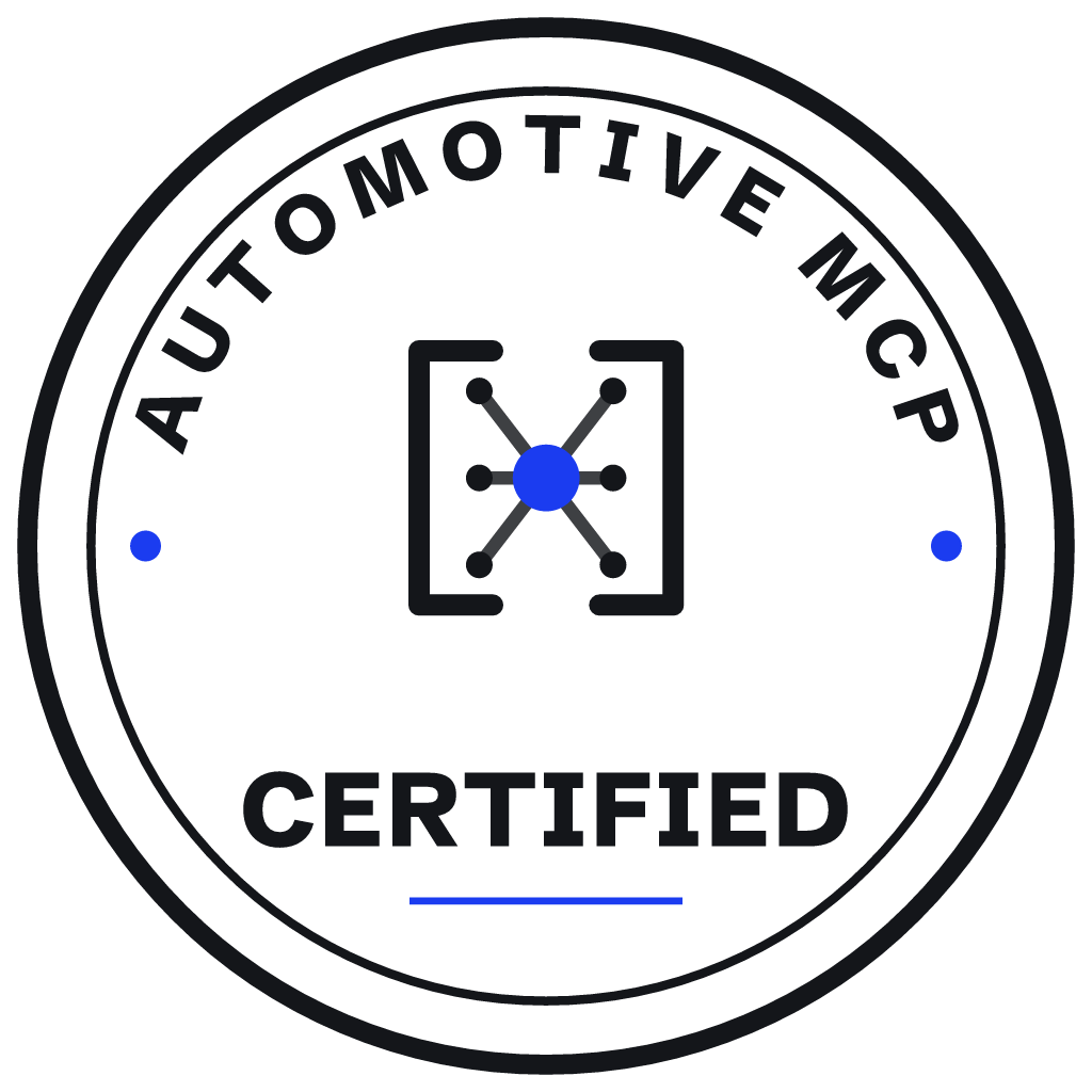
Certification mark
A formal seal: council text curved over the mark, the conformance line below. Always version-pinned.


Favicon & app icon
App icon = white mark on a cobalt tile. Favicon uses the simplified, bolder glyph so it survives 16px.
Assets
Portable vector + raster exports. Text-bearing SVGs embed the fonts.